


Silver on the up
The silver rush? Demand for silver has skyrocketed all over the world. Despite the mainstream media’s relative quietude regarding this increase in silver demand, investors have been buying up silver. Also evidenced by mint sales across the world. For example, from January to February 2018 the U.S. Mint sold over 4,000,000 ounces of silver. In that same period of time in 2019, the U.S. Mint sold over 6,000,000 ounces of silver. In any other market, a demand increase of 50% year-over-year would gain some notoriety. As traders, we look for contra-indicators in sentiment to add confluence to pattern recognition trading strategies and ideas. With silver’s ascending triple bottom looking bullish coupled with a relatively quiet media regarding silver’s demand increase, should at least warrant the consideration of low-risk accumulation at these levels. Our chartbook from May 17th 2019 and following, illustrates this story in more detail. Silver on the up.
Gold, normally leading the Silver market, sees more and more scenarios like last week:
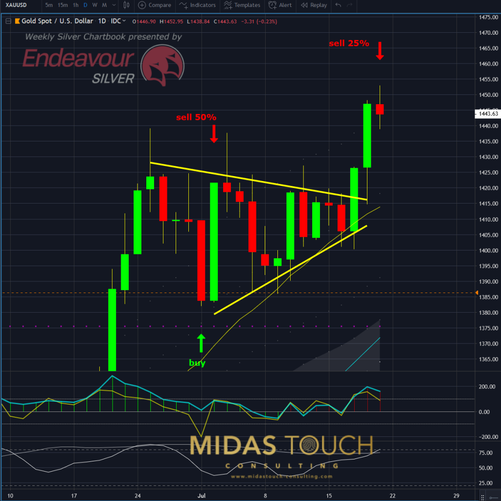
Daily chart of gold 7/15/2019, bullish triangle:
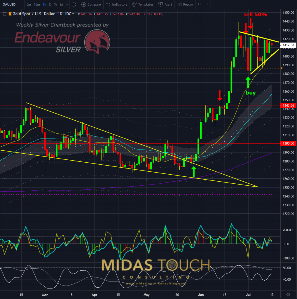
Gold in US-Dollar, daily chart as of July 15th, 2019
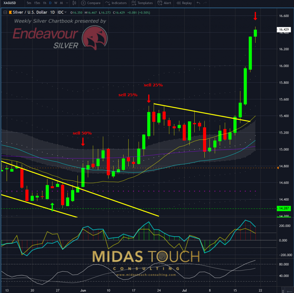
Silver – July 15th 2019, daily chart, Silver at overhead resistance:
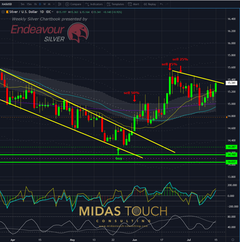
Silver in US-Dollar, daily chart as of July 15th, 2019
A bullish formation on both Gold and Silver. Shortly after, Silver breaks out of its range:
7/17/2019, Silver on the move:
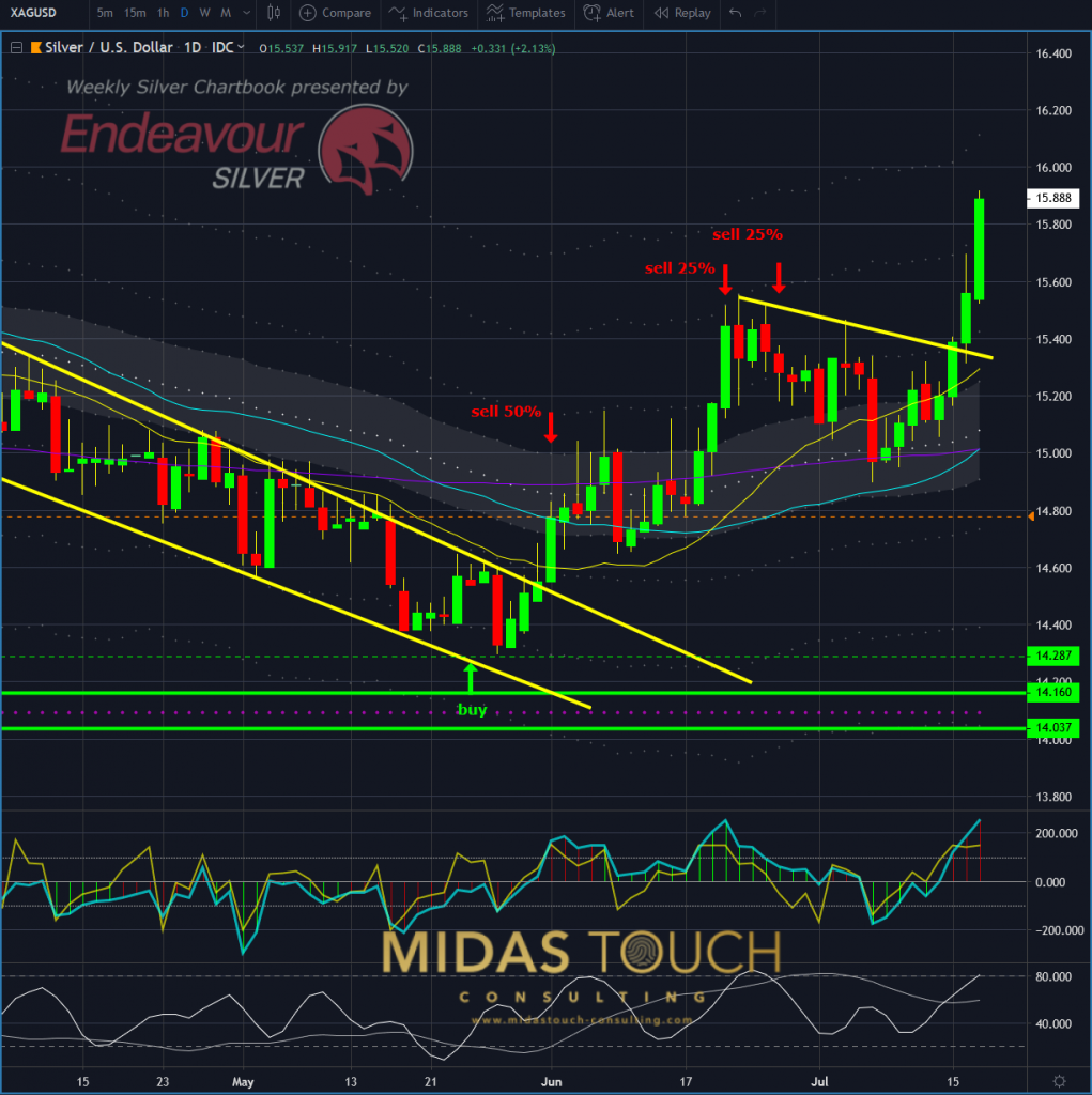
Silver in US-Dollar, daily chart as of July 17th, 2019
While Gold still stays dormant:
Gold – July 17th 2019; Gold lagging:
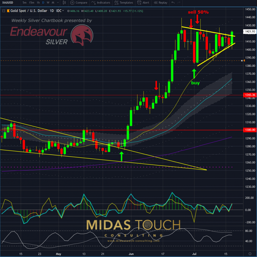
Gold in US-Dollar, daily chart as of July 17th, 2019
Two days later our gold position yet reached another profit target zone, all our entries and exits are posted in real time in our telegram channel:
July 19th 2019, gold profit target reached:
Gold in US-Dollar, daily chart as of July 19th, 2019
Far so, in size of expansion, in comparison to the bull run in Silver:
Daily chart of Silver July 19th 2019; profit target zone for weekly time frame players:
Silver in US-Dollar, daily chart as of July 19th, 2019
We try to illustrate with this example that macro economics may reflect in micro time frames.
Let us not forget that gold is trading at a multiple of the basic cost basis of its value to get it out of the ground. One could say it is expensive in comparison. And from an emotional perspective the simple price tag per ounce may make some shy away.
In further support of the underground silver rush, demand has increased in both Australia and India. In Australia, according to the “Perth Mint Gold and Silver Bullion Sales 2018 Report“, so far sales have jumped 19.6% month after month. In India, where silver’s store of value also expands its intrinsic value to include industrial purposes, an increase of 104.4% in silver demand occurred from 2018 to 2019, according to the Government of India Department of Commerce.
But it’s not just the demand-side that may lead to explosive silver growth. The supply side is just as critical, as the cost of silver mining has increased to such a degree that many companies are reporting massive increases in their cost of production, with many of them pulling back on exploration spending.
For example, in major silver producing regions like Mexico, the supply has already begun to see shortages. Basic demand and supply economics would warn that if the supply side issue continues and the demand increases, silver prices may be in for parabolic growth.
Follow us in our telegram channel.
If you like to get regular updates on our gold model, precious metals and cryptocurrencies you can subscribe to our free newsletter.

