


The unexpected
One easily gets lured in by ones emotions triggered from the environment. Prices flickering before ones eyes on the computer screen. Certainly colleagues at work sharing their opinions. Above all, media hype with headlines exaggerating facts. Consequently, there can be conflict of when to act. Removing oneself to a higher time frame view and form ones own opinion and trading execution plan is necessary. Blaise Pascal put it best: “All of humanity’s problems stem from man’s inability to sit quietly in a room alone.” The following monthly and weekly charts show just such a possibility, where the unexpected might happen. Consequently prices possibly turning not at the usual horizontal support resistance zones, that are so overused in typical technical analysis.
Oct 3rd 2019, BTC/USDT, weekly chart, the unexpected:
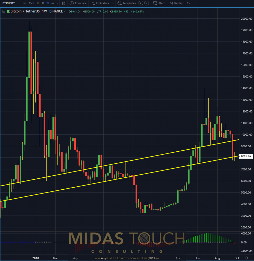
Bitcoin in TetherUS, weekly chart as of October 3rd 2019 a
Usual methods for entry can be used, should the next turning point be at a classical horizontal support resistance zone. What we find useful is to be prepared for the lesser obvious. The weekly chart above shows how prices behaved last time they touched the lower yellow directional support resistance zone.
BTC/USDT, monthly chart October 3rd 2019, the larger picture:
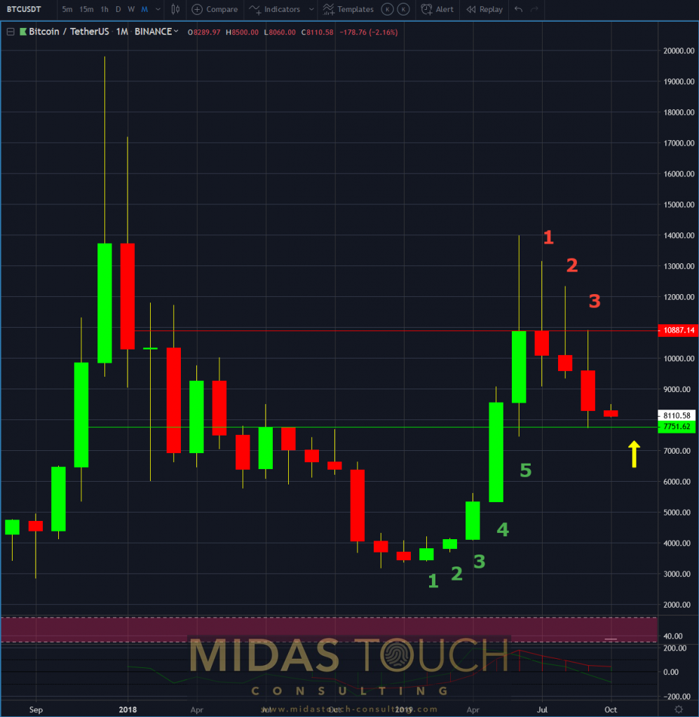
Bitcoin in TetherUS, monthly chart as of October 3rd 2019
The monthly chart, here in its reduced form, represents harmony. Firstly a five count expansion from the beginning of the year. Secondly a proportionally sound three to four count contraction. This could set up just the turning point we are looking for. Risk reward ratios looking mutually attractive.
BTC/USDT, weekly chart October 3rd 2019, stacking edges:
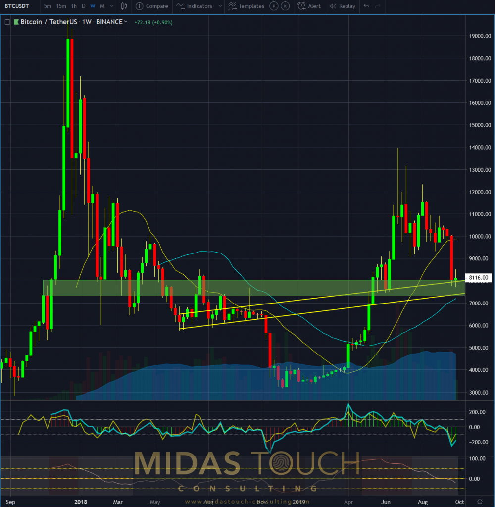
Bitcoin in TetherUS, weekly chart as of October 3rd 2019 b
Stacking odds of ones verified tools, with an independent view from the crowd. At times the best method to have an edge over other market participants. The weekly chart above provides a few of those possible technical analysis tools to watch out for:
- Action/reaction principle after a swift 20% decline in price.
- Directional trend line support (lower yellow line).
- Entering green buy zone (fractal summation).
- Upcoming 40 simple moving average support (blue line).
- Oversold readings on indicators and oscillators.
- Average volume market participation confirmation (blue cloud).
You find some of our tools used here.
When emotions get triggered they ask for energy release. Over trading, chasing trades, and many more loss creating behaviors can be the result. The more advanced trader might be able to contain immediate energy release actions, but still hopes for confirmation. In this case a swift price decline to the US$7,000 zone or bar takeouts on price charts to the upside. The truly astute trader follows Pascals advise and forms his/her independent scenario and prepares in addition – the unexpected.
All charts timely posted in our telegram channel.
If you like to get regular updates on our gold model, precious metals and cryptocurrencies you can subscribe to our free newsletter.

