


A Silver view through time
Last week we were making a point about how we approach principle based a complex theme of how to take profits. We shared how we found solutions in our Quad Exit Strategy that helps mitigate risk. Risk is our main focus, it being in our opinion one of the most dominate principles to be taken care of in this profession.
One important way of how to measure risk is viewing the market sliced through time. Simplified, one wants to know what the various competing forces are doing.
In this weeks chartbook we will provide such a view through time.
We will find an alignment in the time frames which helps to take positions and guides of how to manage them in their relation.
This 15 minute chart of Silver versus the US Dollar shows nicely of how the last seven daily periods price action fluctuated in a sideways channel after having peaked out near the $15.85 price level.
The week closing near the low of the channel hints towards temporary weakness and confirms our last weeks profit taking on the smaller time frames.
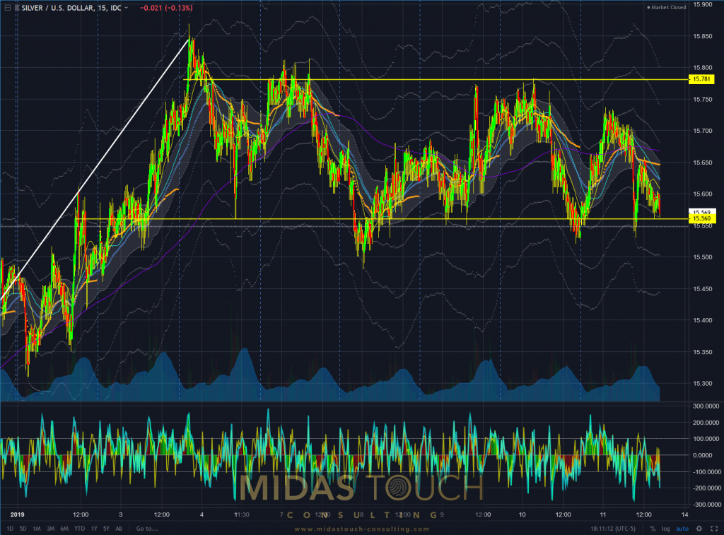
Silver in US Dollar, 15 minute chart as of January 12th 2019.
The daily chart illustrates even clearer how price action changed from an upward thrust to a sideways congestion. It also shows clearly how the $15.70 to $15.85 price zone is a clear distribution zone and as such provides temporary resistance.
As much as we still have a bull flag as a bullish chart pattern price formation, from a money management perspective of these lower time frames having taken profits is principle based. This both from the perspective that a temporary direction has come to a halt, and that capital exposed over time in itself represents risk.
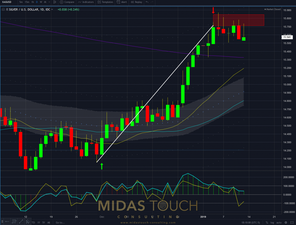
Silver in US Dollar, daily chart as of January 12th 2019.
Core information should always be taken from the larger time frames. This based on the fact that the larger the players the higher the time frames. It simply takes time to liquidate larger positions, and one shouldn’t try to fight Goliath. So a top down approach is warranted for and we only started our chart book from the smaller time frames to complete the narrative from last weeks Silver analysis.
This being said, we were right on with our allocation of funds on this time frame. You will find our entry recommendation at the time in our Silver chartbook post from the 15th of November last Year.
We financed (took 50% off) this trade at last weeks price tops. The closed out daily trades helped reduce exposure risk of this larger time frame funds exposure.
The thin white lines in this chart represent a mathematical representation close to standard deviation with the white channel showing the mean. Price trading at the mean right now allows for further expansion to higher price levels and we presume the next target level to be near the $16.80 price zone.
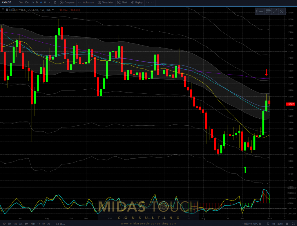
Silver in US Dollar, weekly chart as of January 12th 2019.
Finally the monthly chart brings clarity to the larger picture and demonstrates that entries were taken at an ideal level of extremely low risk. This isn’t hindsight but can be found in one of our prior chart books.
Let us take the opportunity to mention the choice of indicator in technical analysis. Many advise to use very few indicators in their choice of tools, and to learn the behavior of these tools well. This is good advise for beginners and semi professionals as well. What is rarely mentioned in literature so, is that the truly professional approach is to know most of all the tools available and rather find their application in alignment to the object and time frame of the desired trading instrument.
The monthly chart of silver shows exceptionally well of how the Fibonacci retracement levels are in harmonious alignment with support resistance levels and trading behavior as a whole.
This was helpful in establishing desired price levels to enter this position, as well as needed confidence to do so on size.
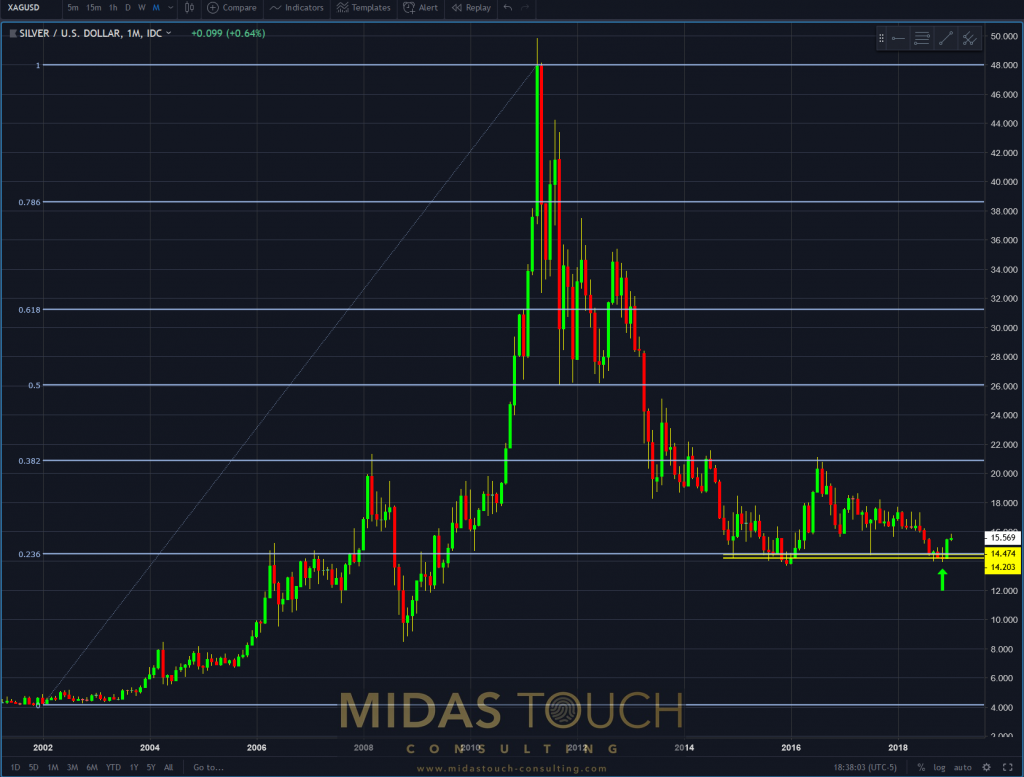
Silver in US Dollar, monthly chart as of January 12th 2019.
Our position on this larger time frame has instantly left our price entry zone and allows for much room still to go to the upside. Due to the precise timing on very low risk we are in the fortunate position that even in the unfortunate event of precises declining from here on , this trade not going to turn into a looser.
All trades on lower time frames already being either full or partial winning trades, makes our whole capital exposure towards Silver already a very prosperous one, with still possible room for prices to go even higher.
Follow us in our telegram channel.

