The bigger picture – The dollar to silver relationship long term:

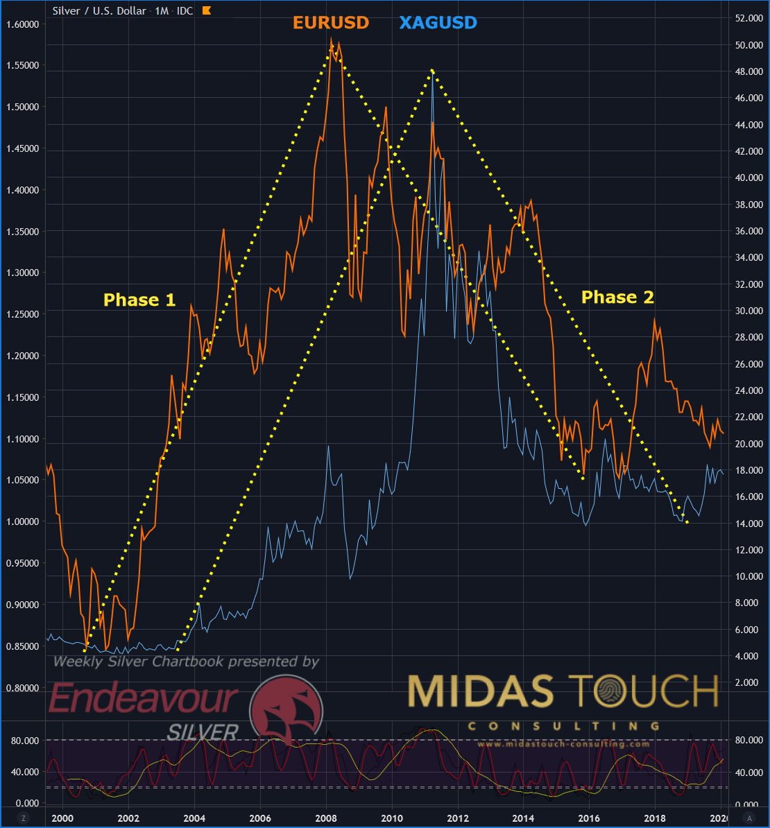
Silver in US Dollar, monthly chart as of February 8th, 2020
Since the introduction of the European common currency called Euro (EUR) the US-Dollar index is measured by the change in value against six currencies. Those are the Euro (EUR = 57,6%), the Japanese Yen (JPY = 13,6%), the Britisch Pound (GBP = 11,9%), the Canadian Dollar CAD = 9.1%), the Swedish Korona (SEK = 4,2%) and the Swiss Franc (CHF = 3,6%). As you can see, the most influence towards the price of the US-Dollar Index is coming from the daily market movements between the Dollar (USD) and the Euro (EUR). It is therefore prudent to use the EURUSD pair as a proxy when questioning the trend direction of the US-Dollar.
In phase 1 the dollar was very weak. This is represented by the EUR/USD currency pair (orange line) having a multiyear bull run. It advanced by a hundred percent from $0.82 to $1.60. With an approximate three year delay, silver prices (blue line) enjoyed a mutual price advancement. It moved from US$4.05 to US$49.83, which equals a 1.130% gain.
In phase 2 the EUR/USD currency pair declined from its US$1.60 highs to a multiyear support zone near the US$1.05 price level. Just like in phase 1 silver has found it extreme price level within a three year delay of EUR/USD. It declined as well form its highs of US$49.83, finding support around the US$14.00 price zone.
Silver and US-Dollar monthly Chart – What the future might hold for silver prices:

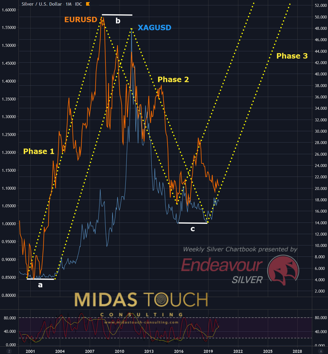
Silver in US Dollar, monthly chart as of February 8th, 2020 b
Phase 3 is speculative in nature. The time delays of roughly three years represented through a, b and c do seem intriguing. Both the Euro and Silver have found supporting supply and demand zones. This turning point hypothesis would be in alignment with fundamental reasoning.
The bigger picture
Fundamental analysts are often head to head with technical analysts. Our rational minds have a need to find rhyme and reason within event chains. We find it beneficial to approach the markets from various angles. Why leave out good charting? “A picture is worth a thousand words” and might just save some time.
The sum of both, macro and micro fundamental forces, can easily be confusing. This because multiple forces pulling in various directions and many moving parts creating to many variables. It is helpful to bring a larger time frame chart to the mix. Creating a singular view through a chart can summarize a complex intellectual structure into a clearer scenario.
We post real time entries and exits for the silver market in our telegram channel. Follow us in our telegram channel.
If you like to get regular updates on our gold model, precious metals and cryptocurrencies you can subscribe to our free newsletter.


