


Silver Weekly Chart: Brace Yourself
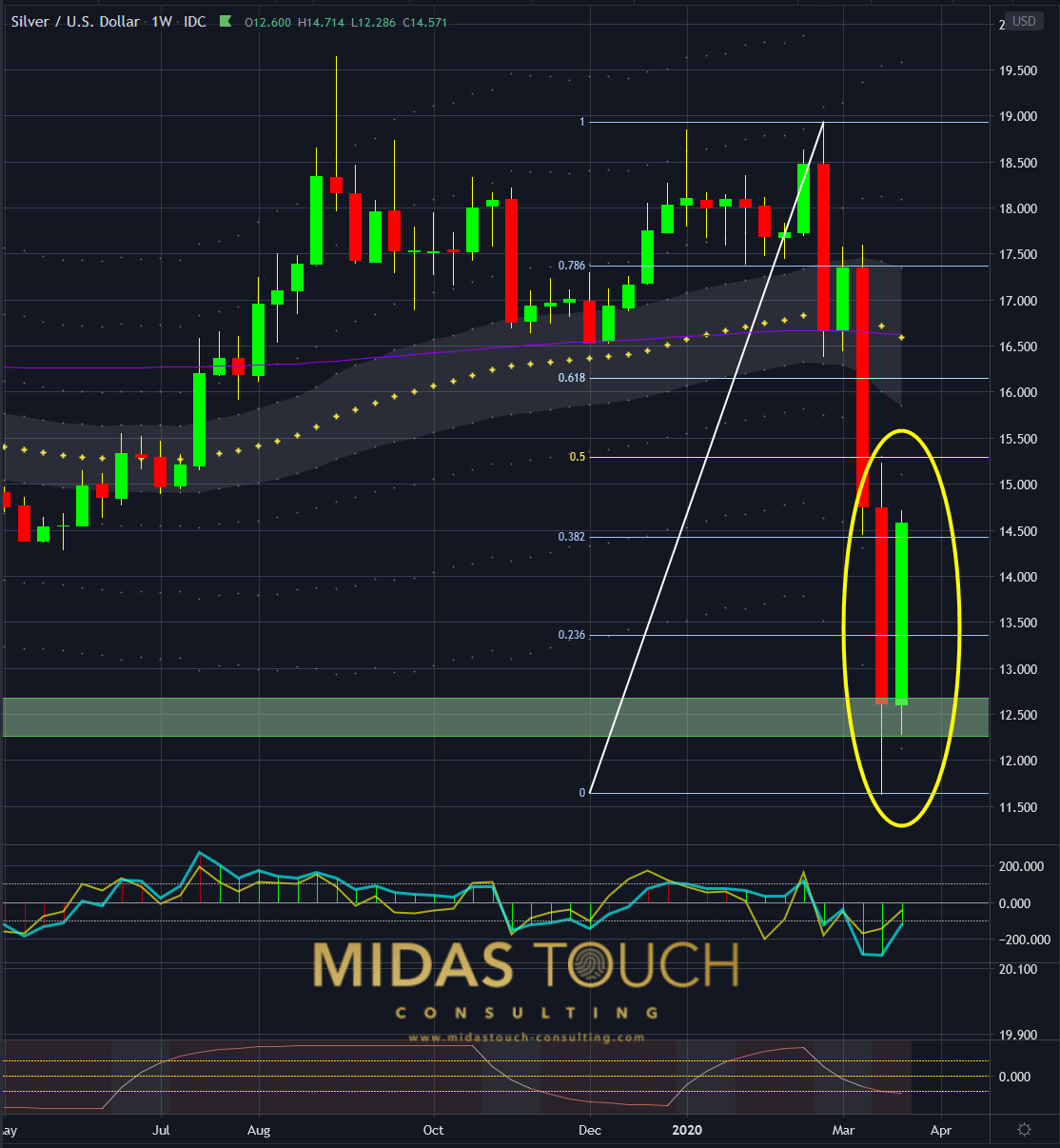
Silver in US Dollar, weekly chart as of March 27th, 2020
The weekly chart shows good strength (above 0.382 Fibonacci retracement) on this tweezers bottom (yellow circle).
It would come at no surprise recent lows to be retested in the near future. (a double bottom formation in the US$12.50 price zone would be considered a low risk entry zone)
New lows can easily be printed as well.

Silver Daily Chart: Various Scenarios
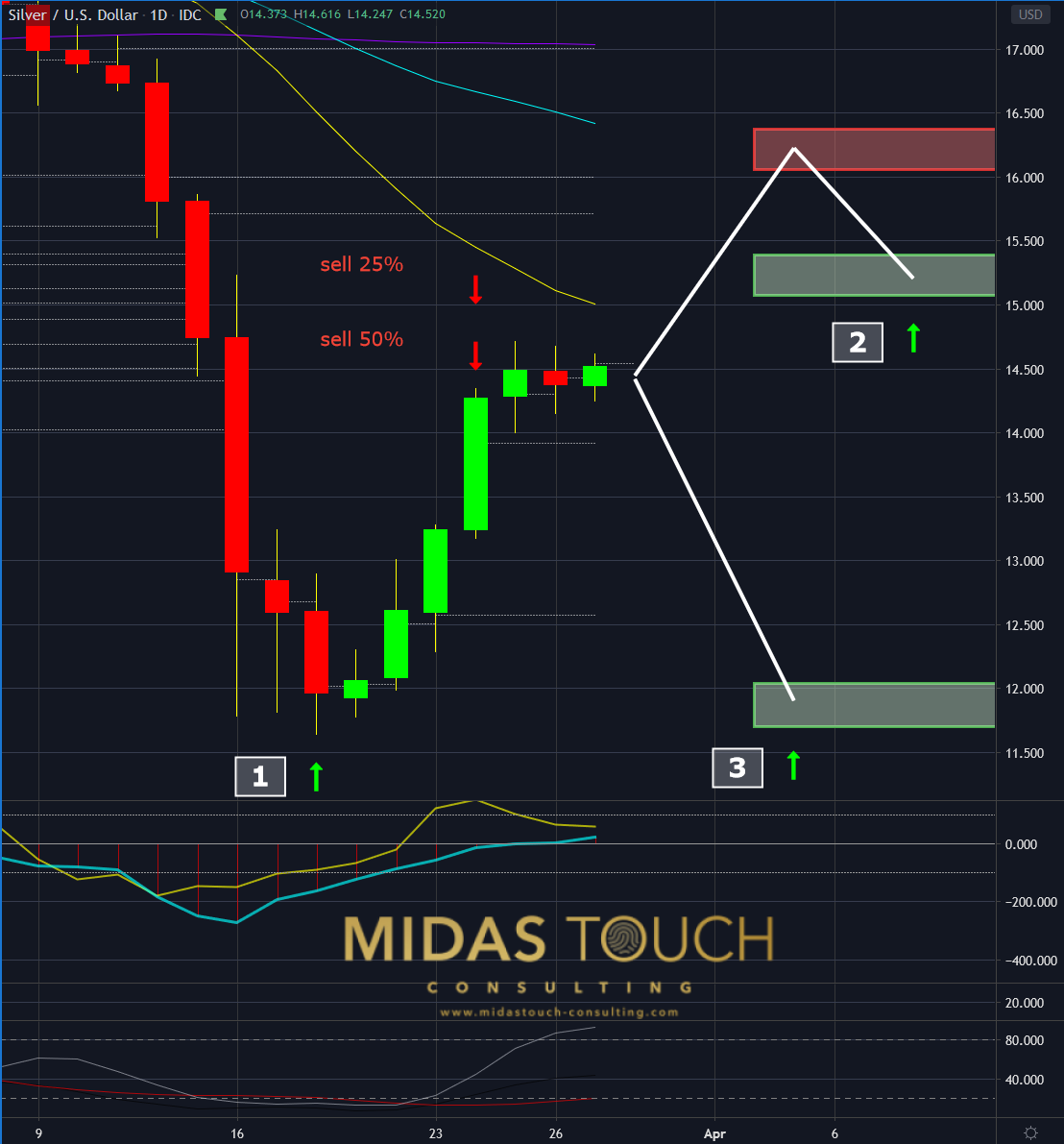
Silver in US Dollar, daily chart as of March 27th, 2020
The daily chart shows three scenarios:
- If you followed our telegram channel, where we post our trades in real time, you are well positioned and already enjoyed substantial profits (including additional reloads not shown in this chart).
- Assumes a speculative price advance with an entry zone after a pullback.
- Anticipates an immediate price decline with a low risk entry zone.
Brace yourself
Last weeks bounce created new technical data usable for reentry points. After the initial three week drop, there is more clarity in charts. Now is the moment to plan for the future. Not at the time when a new down leg in the market is happening and you get bombarded with negative news again. Proactively planing, for example hedge portfolio remainders by collecting double digit dividends in oversold oil stocks in the mid term, can be a passive strategy to avoid disaster. Above all, we believe strongly that silver prices over the long term are one of the finest ways to counteract a multitude of problems financial systems will be confronted with in the future.
Part of these opportunities already show their hand. Simply google e-bay sales prices of physical silver coin and bullion. You will find sales already priced near 100% over its paper value.
We post real time entries and exits for the silver market in our telegram channel. Follow us in our telegram channel.
If you like to get regular updates on our gold model, precious metals and cryptocurrencies you can subscribe to our free newsletter.

