


Silver, you got to know how!
We have identified the most commonly made mistake in technical analysis to be the representation. Representation equals psychology! Psychology being the most important aspect of trading means that the way charts are represented is extremely important. Rarely do we see trading supportive setups. Silver, you got to know how!
Here are a few tips we find useful to get the best out of your chart space.
Less is not always more.
In our opinion charts from cell phones are useless. Their aspect ratios and general size do not allow for the professional to translate into a decision-making process that is conducive to execution. While larger handheld devices and small laptops are an upgrade to these stamp size representations, we still vote for a multi-screen trade setup for the following reasons. For back testing and chart analysis you want to see nuances of various time frames represented next to each other.
For execution, you want a quiet workspace meaning it isn’t conducive to flip between work spaces or expand and collapse windows. Take small time frames. Sorting and execution windows should be outside your main visual sensory field as they produce a lot of data leading to data exhaustion over time. Split widescreen monitors into halves or thirds because stretched chart windows distort the ratio to the point that trend and range differentiation are hard to make out. This being one of the most important things to read out of a chart.
Silver, Monthly Arithmetic Chart. Silver, you got to know how!
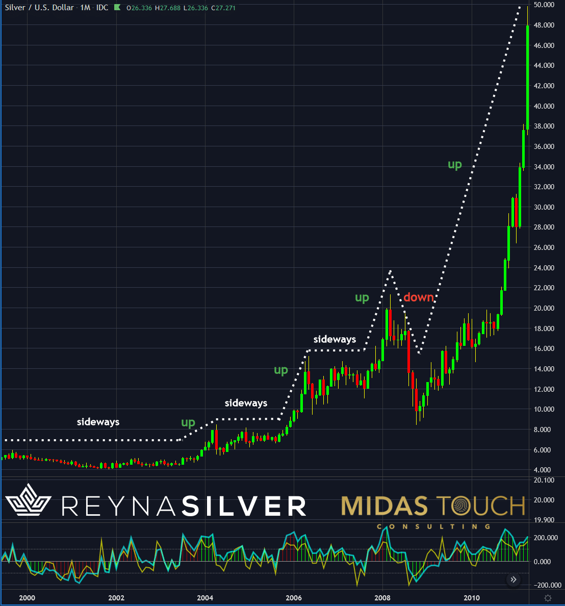
Silver in US Dollar, monthly chart 1999 – 2011, as of January 7th, 2021.
Another aspect little known is the principle on how to use arithmetic versus logarithmic charts. You want to use arithmetic charts for shorter time segments to have an accurate representation of trends and ranges. For long term monthly data it is advisable to use logarithmic representation. This is due to the fact that event proportions get swallowed once price ranges are stretched.
Let us illustrate. If you compare the above arithmetic chart, from exactly ten years ago with the logarithmic one below, you will find a vast difference in how one can interpret price movement at first glance. Looking at a larger time segment with vast price movement the arithmetic representation “swallows” data through compression. What is interpreted as insignificant noise (to the very left of the chart) in the arithmetic chart, with a two-year sideways segment, becomes significant in the logarithmic chart where one can see much more clearly that we had a major downtrend of a 32% price drop.

Silver, Monthly Chart, Logarithmic, Silver, you got to know how!
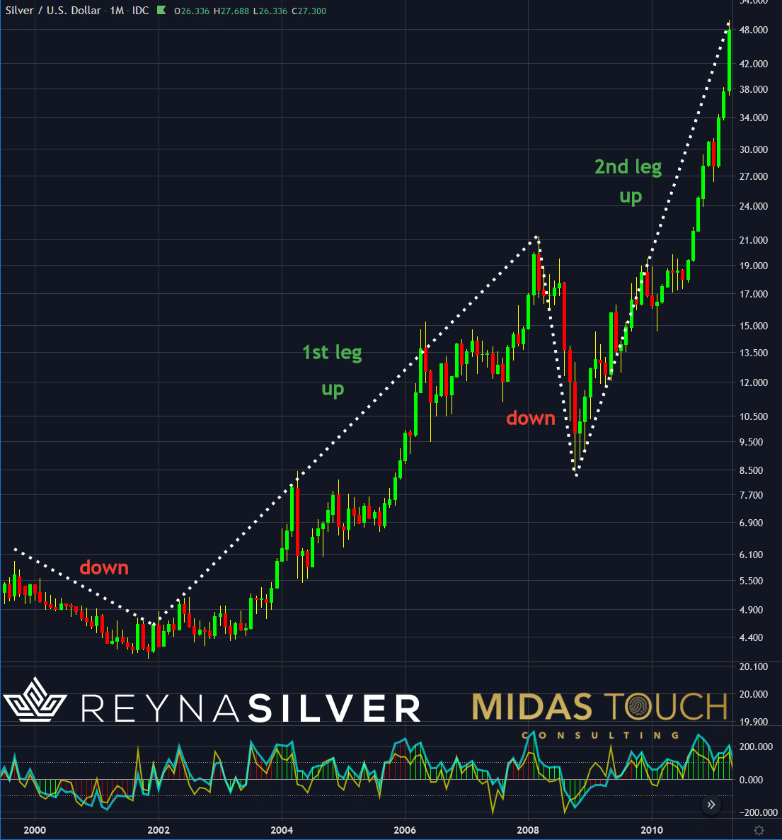
Silver in US Dollar, monthly chart 1999 – 2011, as of January 7th, 2021.
Secondly, the logarithmic representation shows much more clearly that from this price drop low at US$4.05 a clear uptrend established. This with two major up legs advancing to US$49.83, representing a 1,130% gain.
Silver, Monthly Chart. Starting the year with a large time frame overview:
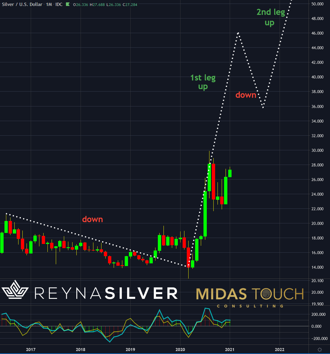
Silver in US Dollar, monthly chart 2016 – 2022, as of January 7th, 2021.
Why a correct representation like this is significant becomes obvious when looking at the present time. The recent directional advancement of Silver prices is birthed out of a previous 34% drop. This is even more significant if you include the quick washout, represented by the down wick, which accounts for a 45% drop. Prices have more than doubled since those lows. Enough reason to look in the past of Silver price behavior at the beginning of possible longer trends. Without the use of a logarithmic presentation, one might have not ever noticed a possible similarity.
In short, it is essential once looking at larger time stretches on larger time frame charts to consider the use of a logarithmic representation. Otherwise, you might lose analysis opportunity through chart compression.
Technology marketing tries to sell us all sorts of gadgets blinding us to believe that technological toys empower a better trading result. Wrong! Do not get lured into trading on the fly from your cell phone while driving. Trading is like a competitive sport. You do not win a gold medal at the Olympics while texting your buddies. If you want to win the game of market participation you need to dedicate your time in a quiet space with appropriate tools.
Silver, you got to know how
Execution requires a maximum reduced data density to keep some powder dry for mental capacity in case of surprises, distractions, and other abnormalities to not get into a stress-induced reactionary intuitive field but rather stay focused. Only an anticipatory rule-based execution in this counterintuitive environment leads to success. This principle demands a chart representation as quiet as possible to keep data overloads at a minimum.
We post real time entries and exits for the silver market in our free Telegram channel.
If you like to get regular updates on our gold model, precious metals and cryptocurrencies you can subscribe to our free newsletter.